Background shadow
Data Central – Transforming Pharma Data Chaos into Clarity

Cut duplicate purchases by 30% and boosted approval speed by 40% through a centralized pharma data platform.

Cut duplicate purchases by 30% and boosted approval speed by 40% through a centralized pharma data platform.

Overview:

Data Central is an internal data marketplace designed for Roche (Genentech) to centralize and optimize commercial data acquisition. The platform enables employees to easily discover, compare, and request datasets while giving vendors a seamless way to publish and manage offerings.

My Role: UX Designer (Lead for workflow + dashboard design)
Domain: Enterprise SaaS, Pharma Analytics
Duration: 3 Weeks

Client

Roche - Genentech

Client

Roche - Genentech

Client

Roche - Genentech

Type

Web App / B2B SaaS

Type

Web App / B2B SaaS

Type

Web App / B2B SaaS

Date

Nov, 2023

Date

Nov, 2023

Date

Nov, 2023

📝 Background

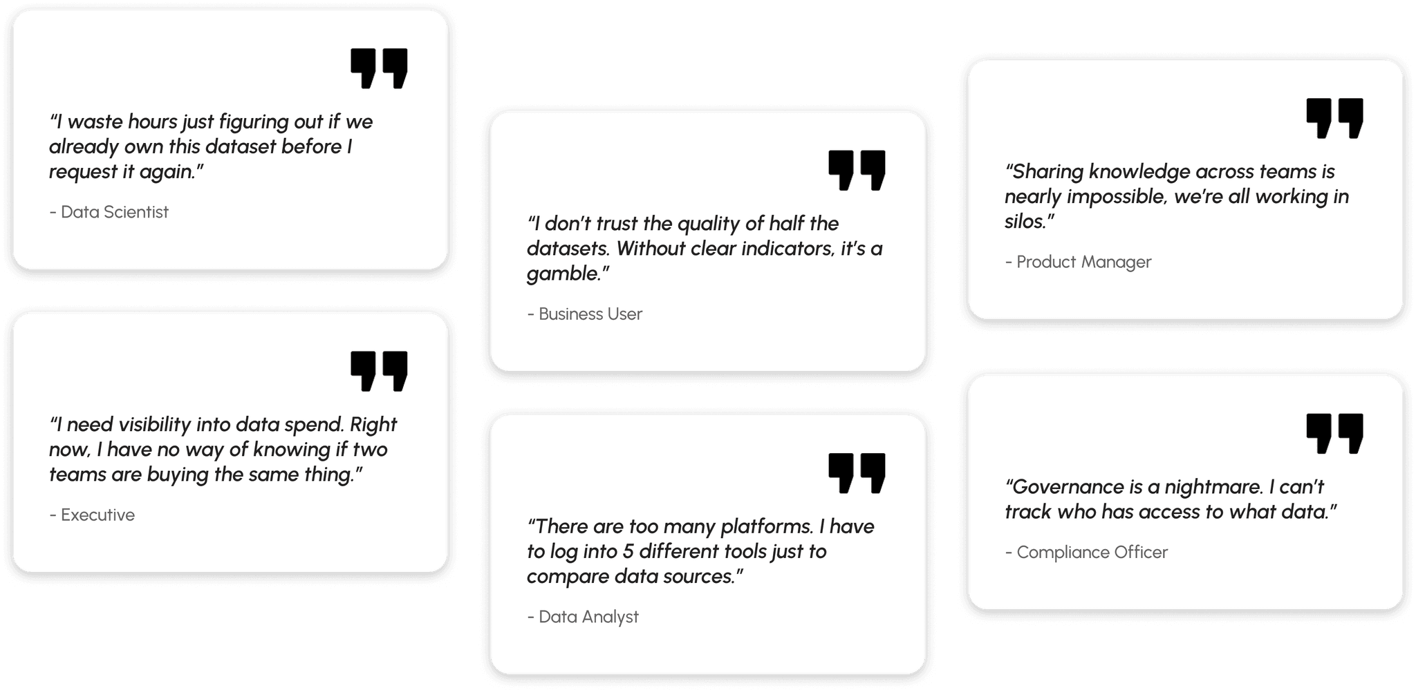
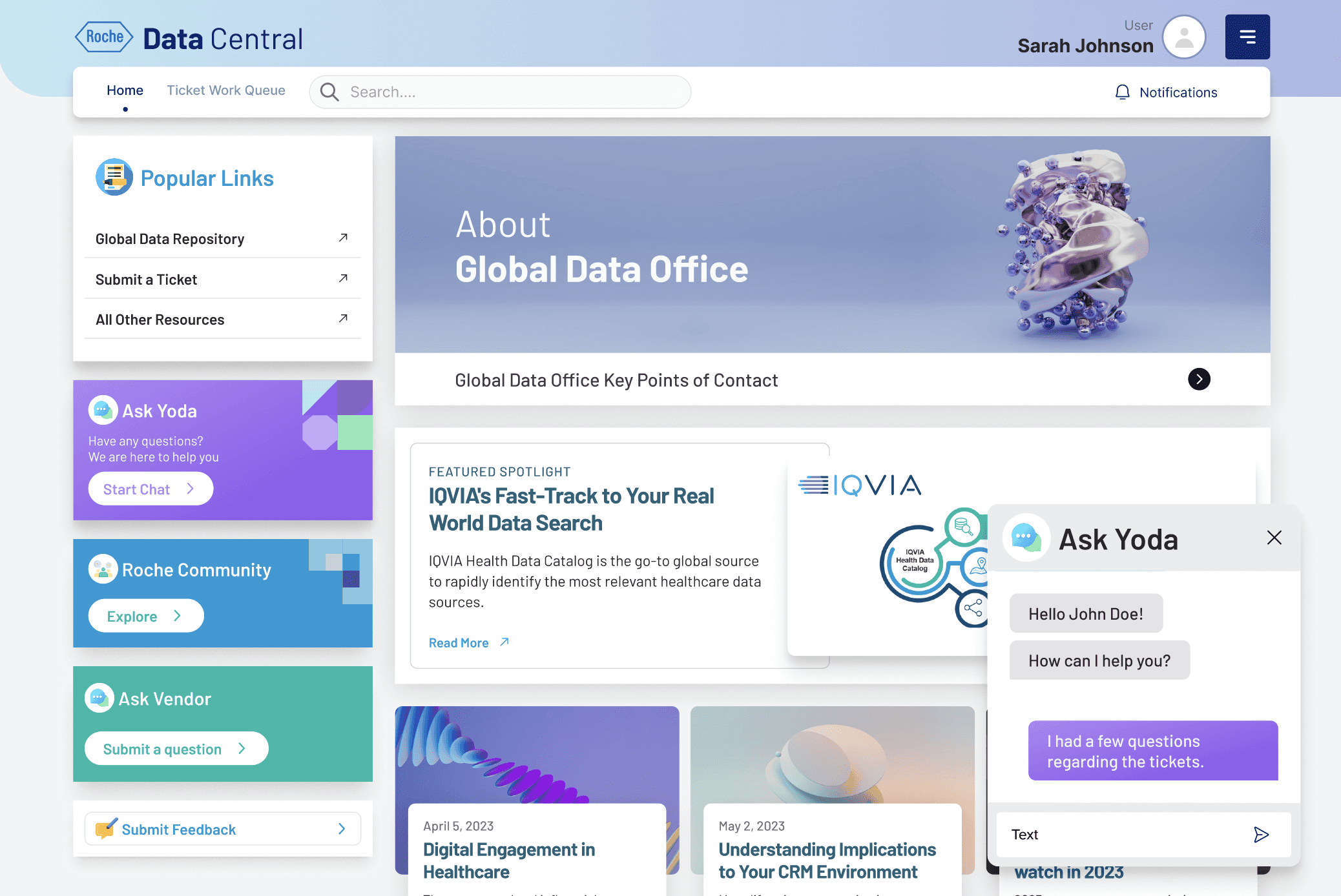
When I joined the Roche Data Office project, teams were drowning in duplicated data purchases and couldn’t even tell if a dataset existed in-house. Millions were being wasted each quarter. That’s when the idea for Data Central was born - a single portal to bring order to the chaos.

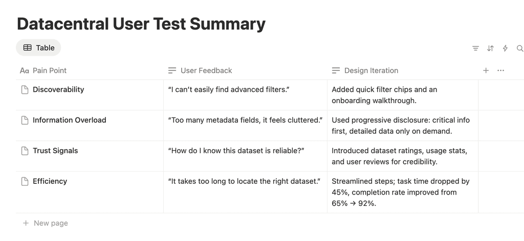
I began by interviewing data scientists, procurement managers, and business analysts. Everyone had different frustrations: some couldn’t discover datasets, others struggled with poor metadata, and vendors found it difficult to showcase offerings. Mapping these voices into user journeys gave me a north star - simplicity and transparency.

⚠️ The Problem Space

🕛

Teams struggled to discover reliable datasets, wasting hours searching and often giving up.

💲

Duplicate purchases were rampant. Multiple teams unknowingly bought the same data, burning budgets.

😕

Vendors felt disconnected, frustrated by lack of visibility into how their datasets were actually used.

The core challenge: Build trust and efficiency into the data ecosystem, without overwhelming users with technical complexity or ignoring governance needs.

🗓️ Project Timeline

💻 Research and Insights

Research Methods
  • Stakeholder Interviews (6 participants): To uncover business priorities like reducing costs and improving governance.

  • User Interviews (10 participants across 3 personas): To understand daily frustrations in data discovery, purchase, and usage.

  • Heuristic Evaluation: Assessed existing data platforms Roche was using, identifying high friction points in navigation and duplicate workflows.

  • Competitive Benchmarking: Looked at data marketplace platforms to see how they handled discovery, cataloging, and transparency.

Key Insights
  1. Duplication & Wasted Spend: Teams often purchased the same dataset multiple times from different vendors due to lack of visibility.

  2. Fragmented Sources: Users needed to log into 5+ tools to find and evaluate data, slowing decision-making.

  3. Low Trust in Data: Without quality indicators or usage metrics, scientists hesitated to reuse datasets.

  4. Governance Gap: No clear way to track who had access to what data, creating compliance and security risks.

  5. Desire for Collaboration: Business units wanted a central hub to share data learnings and reduce silos.

User Personas
  • Executives: Wanted a single source of truth to monitor spend, ensure governance, and cut costs.

  • Portal Users: Needed faster discovery of trusted datasets to speed up research and analytics.

  • Data Vendors: Wanted transparency and simplified access without technical complexity, manage offerings, see utilization and resolve tickets.

Competitor Quadrant
  • X-axis: Ease of Use

  • Y-axis: Governance & Transparency

  • Competitors: AWS Data Exchange, IQVIA, Legacy Systems, and our solution Data Central positioned as the leader.

Where gaps exist
  • Vendor marketplaces: Offered datasets, but no centralized ROI or usage tracking.

  • Internal Excel/email workflows: Flexible, but chaotic, slow, and error-prone.

  • AWS Data Exchange: It’s powerful technically, but doesn’t provide strong organizational governance layers (approvals, vendor negotiations, compliance workflows).

How Datacentral differentiated
  • Positioned well for multi-persona: Governance, vendors, and scientists, not just engineers.

  • Added procurement & ROI tracking: Unique for Data Central's use case

  • Focused on story-driven dashboards for business clarity, others are still raw/technical.

💫 Design Process & Iterative Learning

a) Discovery

I began by mapping frustrations from every corner, data scientists, procurement managers, and vendors. Workshops revealed that while scientists prioritized quality, procurement focused on cost visibility, and vendors wanted autonomy over their data.

b) Utilization Dashboard for Executives
  • Total Active Datasets: Shows overall platform engagement and dataset relevance. Executives see how robust the data library is.

  • Projects Using DataCentral: Indicates how critical DataCentral is to ongoing operations and decision-making.

  • Underutilized Datasets: Shows potential to retire or archive datasets, reducing storage/maintenance costs.

  • Cost Saved: Money saved by using existing datasets instead of purchasing new data. Shows direct financial impact of DataCentral. Calculated with the help of dataset resuses.

c) Data Repository and Comparison

We explored two main layouts for dataset discovery:

  • Card View: Designed for quick browsing with visual summaries and key metadata. While approachable and easy to scan, early versions lacked the depth needed for power users demanding detailed comparisons and bulk actions.

  • Table View: Offered dense, sortable datasets with precise filtering and bookmarking. However, it initially overwhelmed casual users with information and disrupted simple discovery flows.

These insights reinforced the need for a balanced approach, combining card simplicity with table efficiency, to serve both new and advanced users without compromising usability or governance.

Dataset Comparison

One stop shop to learn about vendor road shows, highlights from CDO Office and many other collaborative events

What Worked and Why

We tested two key layouts for dataset interaction:

  • Card View: Made sense for users offering quick, visual browsing of datasets with essential details upfront.

  • Table View: Better suited for vendors, enabling efficient management, sorting, and bulk actions like edit on large dataset inventories.

d) Dataset Details

The dataset provides reliable and structured information that teams can use to make informed decisions, reduce guesswork, and prioritize actions effectively.

e) Ticket Status for Vendor
  • Shows current workload and issues pending resolution. Executives can gauge operational strain and need for prioritization.

  • Demonstrates vendor efficiency and responsiveness. High numbers indicate good SLA(Service Level Agreement) adherence and operational health.

  • Easier workflow to manage and resolve tickets

💻 Building the Design System

I spearheaded a modular design system along with figma tokens powering the entire platform:

  • Reusable dataset cards, approval workflows, and vendor forms ensured consistency from search to governance.

  • Accessibility was non-negotiable: documented contrast standards, keyboard navigation, and inclusive interactions.

  • Our design system scaled seamlessly across four core workflows, cutting developer handoff time by 25% and unifying team practices.

📝 Testing & Feedback

To validate our design decisions initially, we conducted two rounds of usability testing with a mix of 10 pharma analysts, 5 business users, and 3 data governance managers.

🧩 The Result at a Glance

Business Impact

1

Duplicate purchases dropped by 30%, a direct annual savings of millions in procurement costs.

2

Approval workflows were 40% faster, accelerating data-driven decision-making across Roche.

3

User satisfaction saw a 50% leap, with teams reporting genuine trust in the system for the first time.

Reflection & Growth

This project proved that designing for trust and not just usability is the real unlock in data-driven organizations. Balancing diverse personas taught me to avoid “cool UI” traps and instead build harmonious bridges between governance and discovery.

If I had more time, my next move would be deeper personalization smart recommendations guiding users to the right dataset instantly.

Persona 1: Global Data Office​

Utilization Report, Ticket Status, Community Content Management​

Community Buildup and Engagement

One stop shop to learn about vendor road shows, highlights from CDO Office and many other collaborative events

Persona 2: Portal User​

Global Data Repository, Roche Community, Submit a Ticket​

Compare Datasets
Publishing Blog Content

Persona 3: Data Vendor​

Vendors will have a workboard and will be able to have access to respond to user inquiries​

Other Screens:

Onboarding
Home and Chat Assistant
Ask any Questions to Vendors

💻 Prototype

Contact

Get in Touch

Interested in collaborating? Drop me a message, and let’s chat!

© Copyright 2025. Rights Reserved.

Create a free website with Framer, the website builder loved by startups, designers and agencies.